
Ceremony & Light
Soft daylight, warm neutrals and quiet ceremony moments.
Visual collections gathered as a starting point for shoots and spaces — palettes, textures and details that shape the direction of a wedding, a family session or a home.
Each board gathers images, colours and references into one place so the whole look can be agreed on before the camera comes out.
Mood boards help shape the visual direction of wedding, portrait, and lifestyle photography by gathering palettes, textures, lighting ideas, and styling details into one cohesive reference. For couples planning their celebration, these collections can clarify a shared theme that ties together the atmosphere of the day, from airy and minimal to warm and layered. For families and clients creating a portrait session, a mood board offers a calm starting point for discussing color, mood, and environment before the camera comes out. By aligning on visual references early, the photographer and clients can approach the shoot with a clear sense of purpose, making the finished gallery feel consistent, intentional, and true to the feeling they wanted to capture.
The recurring directions that run through the collections, each with the kind of work it usually accompanies.
Soft daylight, warm neutrals and quiet ceremony moments.

Golden tones and close framing for intimate portraiture.

Materials, surfaces and colour that shape an interior.

Deeper shadows and a little drama in the frame.

Light palettes for relaxed, natural celebrations.
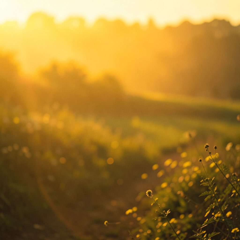
Clean references that pair well with shared downloads.
A quick look at how each theme pairs with the rest of the site.
| Theme | Focus | Where to see it |
|---|---|---|
| Ceremony & Light | Daylight, neutrals, quiet moments | Weddings |
| Portrait & Warmth | Golden tone, close framing | Gallery |
| Home & Texture | Surfaces, materials, interiors | Interior Design |
| Free & Minimal | Clean references and downloads | Freebies |
Browse the finished photographs in the gallery, or send a note about a board you would like to see developed further.